
📊 Understanding Outliers with Boxplots
Boxplots are fundamental tools in data analysis, providing visual insights into the distribution of data points. They present a compact view, summarizing trends and highlighting potential outliers that may skew results. Understanding boxplots is essential for anyone involved in statistical analysis, allowing quick identification of the data's central tendency and variability. 🎉
This article delves into the mechanics of boxplots, their construction, and their significance in identifying outliers, giving particular attention to how these outliers can impact data conclusions. By employing boxplots effectively, data analysts can make better-informed decisions and contribute significantly to their respective fields.
Data visualization, especially through boxplots, minimizes complex datasets into understandable formats. As we explore the subsequent sections, you’ll learn about the structure of boxplots, what constitutes an outlier, and the implications of these findings in practical scenarios. Think of insights gathered from boxplots as a stepping stone toward refining data quality.
Additionally, we will present comparative data examples illustrating boxplots versus other visualization methods. By the end of this article, you should feel confident in interpreting boxplots and making effective use of them in your own analyses. Let's embark on this enlightening journey!
Ready to dive into the world of statistics? Let's unravel the mysteries of outliers and boxplots together! 🚀
📊 What is a Boxplot?
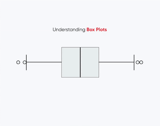
A boxplot, also known as a whisker plot, is a standardized way of displaying the distribution of data based on a five-number summary: minimum, first quartile (Q1), median, third quartile (Q3), and maximum. Boxplots visually encapsulate the data's range and quartiles in a neat visual space, showcasing the data's center and its variability.
To understand how boxplots function, it’s essential to recognize their components: the box, the whiskers, and the potential outliers that exist beyond the whiskers. The box represents the interquartile range (IQR), which houses the middle 50% of the data, while the line within the box denotes the median value. Whiskers extend from either end of the box to the smallest and largest observations within 1.5 times the IQR. Any data points lying outside this range are marked as potential outliers.
Boxplots provide a significant visual summary of the data distribution and are particularly useful in identifying skewness and outlier presence. They are especially popular in exploratory data analysis owing to their ability to depict multiple datasets in a concise manner, especially when presented side by side for comparative analysis.
The elegance of the boxplot lies in its ability to communicate so much with so little—providing insights about the spread, center, and outliers at a glance. In upcoming sections, we will dissect the mechanics behind their construction and interpretation further. 🌟
⚙️ How Boxplots Work
The mechanics of creating a boxplot unfold in several steps, commencing with the calculation of basic statistics like the minimum, Q1, median, Q3, and maximum. Drawing a boxplot incorporates the representation of these statistical measures with respect to their physical placement on the plot.
1. Calculation of Summative Statistics: To construct a boxplot, one begins by evaluating the five-number summary: - Minimum: The smallest data point. - First Quartile (Q1): The median of the lower half of the data (25th percentile). - Median: The midpoint of the data (50th percentile). - Third Quartile (Q3): The median of the upper half of the data (75th percentile). - Maximum: The largest data point.
2. IQR Computation: Following this calculation, we derive the interquartile range (IQR), defined as Q3 minus Q1. This range quantifies the spread of the middle 50% of the data, highlighting the box’s height in the plot.
3. Placement of the Box and Whiskers: With these statistics computed: - The central box is drawn from Q1 to Q3. - A line is drawn within the box to indicate the median. - Whiskers are then extended to the smallest and largest values that are not considered outliers—beyond 1.5 times the IQR from either quartile marks the limits of our whiskers.
4. Identification of Outliers: Outliers are denoted by individual points or marks beyond the whiskers. A point is classically termed an outlier if it is either lower than (Q1 - 1.5*IQR) or higher than (Q3 + 1.5*IQR). The presence of these points often illuminates interesting patterns and informs the data analysis process.
As we proceed, we will elaborate on understanding these outliers' significance and implications. The clarity provided by boxplots empowers analysts to convey critical information in compact presentations. 📈
🔍 Understanding Outliers
Outliers are observations that differ significantly from other observations in the dataset. Identifying such values is crucial as they can skew and mislead the interpretation of statistical analyses.
1. Why Outliers Matter: Outliers can arise due to various reasons, such as measurement errors, data recording mistakes, or natural variability within larger populations. Ignoring these exceptional cases can lead to inappropriate decision-making guides. For instance, when calculating the average income of a group, the presence of an extremely high value can distort the average, leading to misleading conclusions.
2. Analyzing Outlier Causes: It's imperative to examine the context around these outliers. If caused by errors, data cleansing becomes necessary, removing or correcting these observations. Conversely, if outliers arise from legitimate variance, they may indicate noteworthy patterns worth investigating further, suggesting trends or insights.
3. Impact on Analysis: Outliers can heavily impact various statistical measures, such as averages, correlation coefficients, and regression models. They can indicate the need for alternative analytical techniques, such as robust statistics, which lessen the influence of outliers, or even separate analyses that categorize them for specific evaluations.
4. Outliers in Different Contexts: Outlier treatment varies across fields; in finance, they might indicate fraud; in medicine, they could reveal unusual patient responses; while in quality control, they might signal defects. Understanding the context of outliers can empower informed decision-making.
In conclusion, while outliers can present challenges in data analysis, they are also opportunities for further exploration and investigation. Their distinctiveness necessitates careful consideration within boxplot interpretations. 🚀
📊 Interpretation of Boxplots
Interpreting boxplots allows one to derive meaningful insights about datasets. A well-constructed boxplot can tell stories about the distribution, central tendency, and existence of outliers in a dataset.
1. Data Distribution: The box’s length and the whisker extent indicate distribution characteristics. A longer box suggests a wider spread of values, while a narrower box indicates data concentrations around the median. Similarly, if the whiskers are of differing lengths, this suggests asymmetry; the data may be leaning towards one direction.
2. Comparative Analysis: Boxplots are invaluable in comparing multiple datasets. When plotted side-by-side, they allow a rapid analysis of differences in median values, ranges, and the presence of outliers across these comparisons. This is especially useful for categorical variables where groups can be contrasted efficiently.
3. Understanding the Median: The central line within the box highlights the median and acts as a reference point for data centrality analysis. Identifying the median’s position helps observers determine data skewness. If the median is closer to one quartile, this suggests that the data is skewed in that direction.
4. Handling Outliers: Outlier points are plotted distinctly, creating a stark visual representation of variance. Interpreting these points necessitates careful consideration of their nature and origin. While some might be dismissible due to being errors or anomalies, others merit further review based on their context and significance.
5. Enhancing Data Communication: Ultimately, the effectiveness of boxplots in data storytelling lies in their straightforward presentation of key metrics without overwhelming detail. They allow for quick understanding and seamless communication of findings within both analytical and operational contexts.
🚀 Applications of Boxplots
The applicability of boxplots extends across various sectors, serving as indispensable tools for data analysis and communication. Here are notable areas in which boxplots play a critical role:
1. Statistical Analysis: Boxplots are frequently employed in exploratory data analysis (EDA) to summarize key data characteristics efficiently. Analysts often utilize boxplots to understand data distribution before executing further analyses, such as regression or hypothesis testing.
2. Comparative Studies: In clinical trials, boxplots provide quick visual feedback on treatment effects across different groups. By showcasing multiple trial outcomes side by side, researchers can gauge variation and efficacy rapidly, aiding decision-making processes regarding treatments.
3. Business Analytics: Companies leverage boxplots to represent sales data across segments, products, or time periods, allowing them to identify valuable insights quickly. Identifying sales outliers can guide stock management and forecasting tactics.
4. Performance Monitoring: In quality control, boxplots are used to track metrics over time, signaling when variations emerge that require immediate attention. Different production batches may be plotted, illuminating performance inconsistencies and guiding operational improvements.
5. Education and Research: In academia, boxplots serve in instructional contexts, helping students and researchers visualize data effectively. Their role as teaching tools can simplify statistical concepts, making learning more intuitive.
Overall, boxplots are essential for conveying complex data insights succinctly, making them vital instruments across diverse analytical practice areas. Their power lies in presenting comparative, understandable statistics that raise data-driven questions and determine future inquiries. 📊
🧹 Dataset Cleanup Challenge!
Now that you've learned about boxplots and outliers, let's put your knowledge to the test! Cleaning up a dataset is a critical skill for any data analyst. Here’s a practical challenge:
Challenge Instructions:
You are given the following dataset of student scores:
- 65, 67, 72, 81, 93, 100, 110
- 70, 75, 78, 80, 85, 88, 95
- 61, 66, 74, 82, 110, 120
- 85, 88, 92, 95, 104, 107, 200
Tasks:
- Calculate the five-number summary of the dataset.
- Identify any outliers using the IQR method.
- What action would you take regarding the identified outlier(s) in your analysis?
Feel free to submit your answers and reasoning in the comments below! 📝
❓ Frequently Asked Questions
1. What is an outlier, and why is it important?
An outlier is a data point that differs significantly from the other observations. Its presence can distort statistical analyses, making it crucial to identify and understand its context.
2. How are outliers detected using boxplots?
Outliers are detected by plotting points outside the whiskers of a boxplot, which signify values that fall beyond 1.5 times the interquartile range (IQR).
3. Are boxplots suitable for all types of data?
Boxplots work best with numerical data and when one aims to understand distributions, especially in comparative contexts.
4. Can I use boxplots for categorical data?
Boxplots can be used as long as they represent numerical values corresponding to categorical groups effectively, enabling comparative analyses.
5. Where can I learn more about boxplots and data visualization?
For further learning, consider resources like Statistics How To, Data Visualization Blog, and courses on platforms like Coursera and Udemy.
Post a Comment